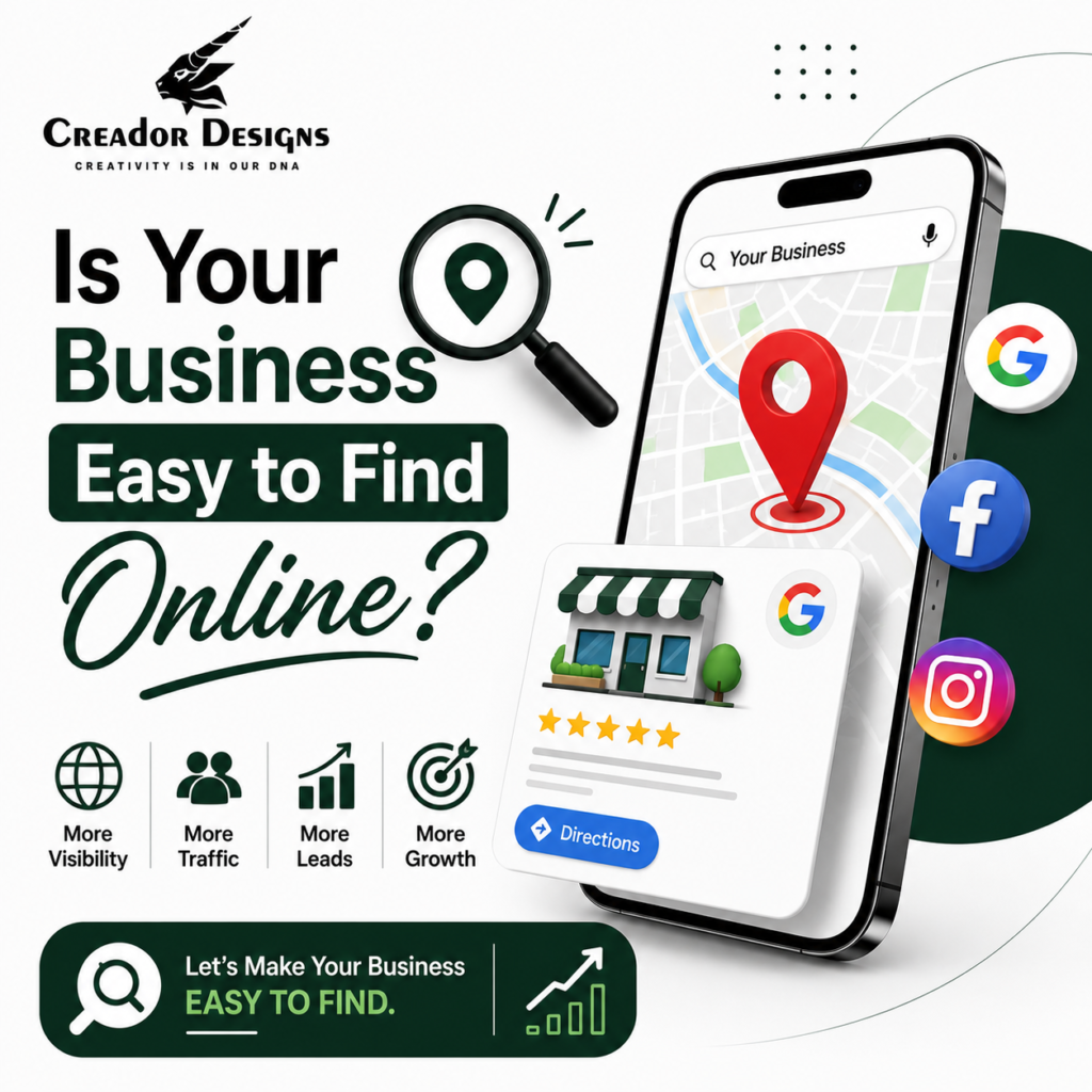
Grow Your Business with Google Business Profile Optimization by improving your visibility on Google Search and Google Maps. An optimized Google Business Profile helps potential customers find your business faster, increases phone calls, website visits, direction requests, and builds trust through customer reviews. Combined with Local SEO, regular profile updates, and accurate business information, Google Business Profile Optimization becomes one of the most effective ways to generate local leads and grow your business.
Key Takeaways
- Google Business Profile improves local online visibility.
- Optimized profiles rank higher on Google Maps.
- Accurate business information builds customer trust.
- Reviews improve local SEO and credibility.
- Regular updates increase customer engagement.
- Google Business Profile Optimization generates more local leads.
What is Google Business Profile Optimization?
Grow Your Business with Google Business Profile Optimization by ensuring your business profile is complete, accurate, and regularly updated. Google Business Profile (GBP) Optimization is the process of improving your business listing on Google Search and Google Maps so customers can easily discover your products or services.
A fully optimized profile helps businesses attract nearby customers, improve local search rankings, and convert searches into inquiries.
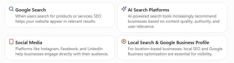
Why Google Business Profile Matters for Every Business
Today, most customers search online before visiting a business.
When someone searches for:
- “Digital Marketing Agency Near Me”
- “Website Design Company in Pune”
- “Branding Agency Near Me”
Google displays local business profiles before regular website results.
An optimized Google Business Profile helps your business:
- Appear in Google Maps
- Rank higher in local search
- Increase phone calls
- Drive more website visits
- Generate direction requests
- Build customer confidence
For local businesses, it’s one of the most powerful free marketing tools available.
How Google Business Profile Optimization Helps Your Business Grow
1. Improve Local Search Rankings
Google prefers businesses with complete and active profiles.
Optimization includes:
- Correct business information
- Relevant business categories
- High-quality images
- Updated business hours
- Detailed service descriptions
A well-maintained profile has a better chance of appearing in local search results.
2. Get Found on Google Maps
Many customers search directly on Google Maps when looking for nearby services.
Optimizing your profile increases visibility for location-based searches and helps potential customers find your business more easily.
3. Build Customer Trust with Reviews
Customer reviews influence purchasing decisions.
Encourage satisfied customers to leave reviews and always respond professionally.
Positive reviews help:
- Increase credibility
- Improve local rankings
- Build trust
- Encourage more inquiries
4. Keep Your Business Information Updated
Incorrect business information can cause customers to lose confidence.
Regularly update:
- Phone number
- Website
- Address
- Working hours
- Products
- Services
- Holiday timings
Consistency across all platforms improves Local SEO performance.
5. Publish Google Business Profile Posts
Google Business Profile allows businesses to publish updates regularly.
You can post:
- Company news
- Offers
- New services
- Product launches
- Events
- Blogs
Regular posting keeps your profile active and increases customer engagement.
6. Add High-Quality Photos and Videos
Visual content attracts attention and builds trust.
Upload:
- Office photos
- Team photos
- Product images
- Project photos
- Behind-the-scenes content
- Customer success stories
Businesses with quality visuals often receive higher engagement.
7. Optimize for AI Search and Voice Search
Customers increasingly ask AI assistants and voice search questions like:
- “Best digital marketing agency near me”
- “Top branding company in Pune”
- “Website design company near me”
A complete and optimized Google Business Profile improves your chances of appearing in both local search results and AI-powered recommendations.
Unoptimized vs Optimized Google Business Profile
| Unoptimized Profile | Optimized Profile |
|---|---|
| Missing information | Complete business details |
| Few customer reviews | Regular positive reviews |
| No posts or updates | Consistent business updates |
| Low Google Maps visibility | Better local rankings |
| Fewer inquiries | More calls and leads |
| Limited customer trust | Strong online credibility |
Best Practices for Google Business Profile Optimization
To maximize results:
- Complete every profile section.
- Choose the correct business categories.
- Add high-quality photos regularly.
- Publish weekly Google Business Profile posts.
- Encourage customer reviews.
- Reply to every review professionally.
- Keep business information accurate.
- Link your website and social media.
- Use Local SEO keywords naturally.
- Monitor profile performance through Google Insights.
Following these practices helps your profile remain active and competitive.
Why Choose Creador Designs?
At Creador Designs, we help businesses improve their local online presence with complete Google Business Profile Optimization strategies.
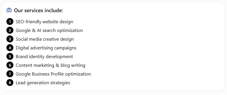
Our Google Business Profile Services
- Profile Setup & Optimization
- Google Maps Optimization
- Local SEO
- Weekly GBP Posts
- Review Management
- Business Information Updates
- Photo & Video Optimization
- Keyword Optimization
- Performance Monitoring
- AI Search Optimization
Our goal is to help businesses become more visible, generate more local inquiries, and build lasting customer trust.
Expert Tips from Creador Designs
To get the most from your Google Business Profile:
- Update your profile every week.
- Add fresh photos consistently.
- Publish informative GBP posts.
- Collect genuine customer reviews.
- Respond to reviews promptly.
- Combine Google Business Profile Optimization with SEO and a professional website.
- Track profile insights to understand customer behavior.
Businesses that actively manage their Google Business Profile often see significant improvements in local visibility and lead generation.
Frequently Asked Questions
What is Google Business Profile Optimization?
Google Business Profile Optimization is the process of improving your business listing on Google Search and Google Maps to increase visibility, attract customers, and generate more leads.
How does Google Business Profile help my business?
It helps customers find your business, view your services, call you, visit your website, read reviews, and get directions directly from Google.
How often should I update my Google Business Profile?
It’s recommended to update your profile regularly by posting weekly updates, adding new photos, responding to reviews, and keeping business information accurate.
Do customer reviews improve local SEO?
Yes. Positive reviews and timely responses improve trust and can contribute to better local search visibility.
Why choose Creador Designs?
Creador Designs provides complete Google Business Profile Optimization, Local SEO, website design, and digital marketing solutions to help businesses increase local visibility and generate qualified leads.
Final Thought
Grow Your Business with Google Business Profile Optimization by making it easier for local customers to discover, trust, and contact your business. An optimized profile improves your presence on Google Search and Maps, increases customer engagement, and supports long-term local business growth.
At Creador Designs, we help businesses maximize the potential of Google Business Profile through strategic optimization, Local SEO, and AI-ready digital marketing solutions.