Product packaging design is never an overnight process—it’s the outcome of countless ideas, revisions, and strategic choices. For Big Mishra, a brand rich in cultural heritage, the challenge was to honor tradition while creating packaging that feels modern, functional, and eye-catching. This blog explores how packaging design evolves, the common hurdles, and how agencies like Creador Designs help brands strike the perfect balance between creativity and practicality.
Why Is Product Packaging Design So Important?
One of the most frequently asked questions is:
“How crucial is packaging in consumer buying decisions?”
The answer is: incredibly important. Product packaging design serves as the first impression between a product and its potential buyer. It conveys trust, emotion, and quality in mere seconds. Without it, even the most outstanding product risks being ignored.
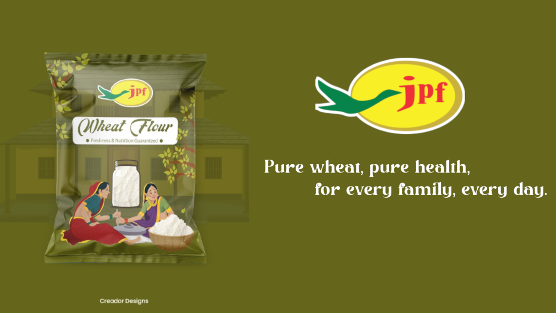
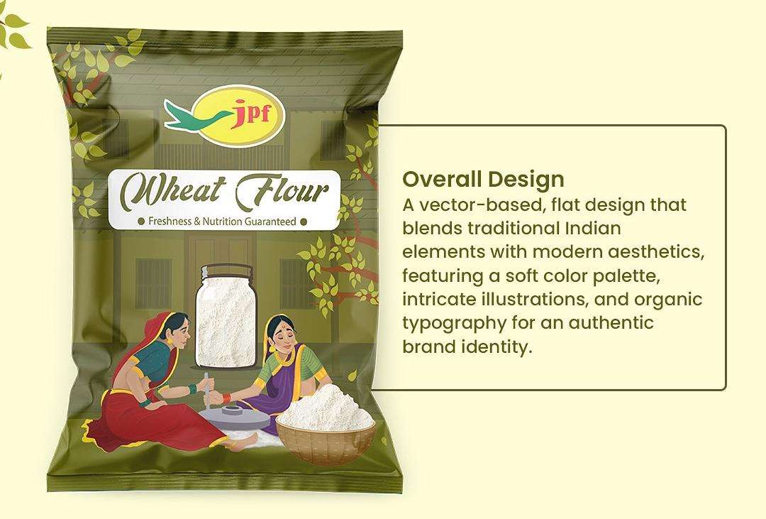
For companies specializing in food packaging design, the stakes are even higher: the design must keep the product fresh, stand out on retail shelves, and reflect the brand’s personality.
For Big Mishra, the packaging needed to:
- Capture the nostalgic essence of traditional snacks.
- Attract younger, modern consumers.
- Balance heritage with a sense of freshness.
This is where product packaging design transcends mere aesthetics; it becomes a narrative for the brand.
What Are the Common Challenges in Product Packaging Design?
A common Quora-style query is:
“What are the main challenges when it comes to designing product packaging?”
Here are some of the hurdles faced during the Big Mishra project—challenges that many brands encounter:
- Heritage vs. Modernity – Striking a balance between keeping loyal customers and drawing in new ones.
- Color Palette Selection – Picking shades that respect tradition while still feeling vibrant and exciting.
- Practicality vs. Creativity – Ensuring the packaging is functional, stackable, and durable.
- Cost vs. Quality – Premium finishes don’t always fit within budget constraints.
- Market Differentiation – Standing out from the competition while staying true to brand values.
At Creador Designs, these challenges aren’t roadblocks—they’re opportunities to innovate. They inspire our packaging design agency to think beyond the obvious and create packaging that connects with people emotionally and functionally.

How Do You Balance Creativity and Functionality in Packaging?
Another widely asked question is:
“How do you strike the right balance between creativity and practicality in packaging design?”
This is a core element of product packaging design. Effective packaging should:
- Be visually captivating.
- Safeguard the product during shipping.
- Stay budget-friendly.
- Align with sustainability goals.
For Big Mishra, creativity was expressed through vibrant accents and modern typography. Functionality was achieved with sturdy, protective designs that kept products fresh, were easy to transport, and offered consistency across all outlets.
This balance is what sets apart seasoned food packaging design companies. They don’t just create wrappers they design experiences that resonate with consumers.
Creativity vs. Practicality in Product Packaging Design
Finding that sweet spot between creativity and practicality is one of the biggest challenges in product packaging design, yet it’s also where the most innovative solutions emerge.
What Role Does Packaging Play in Consumer Buying Decisions?
On Quora, many users ask:
“How much does packaging really affect what customers choose?”
Studies show that 70% of buying decisions happen at the shelf and often in just seconds. Packaging influences these decisions through:
- Colors that evoke emotions (warm for trust, bold for excitement).
- Typography that reinforces brand confidence.
- Structure that communicates quality and ease of use.
- Transparency (literal and brand-driven) that builds trust.
For Big Mishra, authenticity was the benchmark. Their packaging had to feel familiar enough for loyal customers while being eye-catching enough for new consumers in a crowded marketplace.

What Are the Key Elements of Effective Product Packaging Design?
Another common Quora-inspired question is:
“What makes packaging truly effective?”
Here are five key design elements for effective product packaging design:
- Color Strategy – Culturally relevant, emotionally impactful, and category-appropriate.
- Typography & Logo – Simple, bold, and tied to brand storytelling.
- Structure & Material – Durable, eco-friendly, and consumer-friendly.
- Brand Consistency – Designs should reflect the brand identity across SKUs.
- Sustainability – Increasingly vital in 2025 as eco-conscious buyers prefer recyclable or biodegradable packaging.
For Big Mishra, these principles ensured the final design was eye-catching, durable, and future-ready.
Conclusion
Working with Big Mishra highlighted that product packaging design is never simple it’s a blend of heritage, consumer psychology, and design strategy. At Creador Designs, we thrive on these challenges because they spark innovation. Each obstacle becomes a stepping stone to craft packaging that protects, persuades, and connects.
Remember: packaging isn’t just a wrapper. It’s a brand’s handshake with its audience. When done right, it communicates more than any advertisement ever could.
For a detailed step-by-step guide on product packaging design, you can also check out Shopify’s complete guide on product packaging design