In the bustling FMCG world, where countless masalas, snacks, and packaged goods fight for attention, packaging is far more than just a container. It acts as a silent salesman, a storyteller, and the first brand impression. Great design doesn’t just protect a product it attracts, engages, and convinces customers to choose your brand. When searching for a branding agency in Pune, one name stands out Creador Designs. Their recent collaboration with RR Bhagat Spices proves how smart packaging design can redefine brand identity and forge emotional connections with customers.
Case Study: RR Bhagat Spices Packaging by Branding Agency in Pune
RR Bhagat Spices, known for authentic spice blends passed down through generations, wanted packaging that honored its legacy yet appealed to today’s households. They partnered with Creador Designs, a leading packaging design agency in Pune, to bring this vision alive.
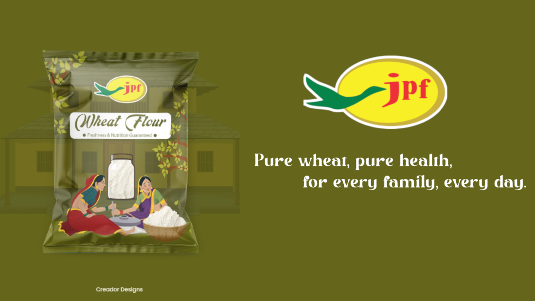
 Here’s a glimpse of the new RR Bhagat Spices packaging crafted by Creador Designs.
This redesigned look became the cornerstone of the brand’s identity across digital platforms and retail shelves.

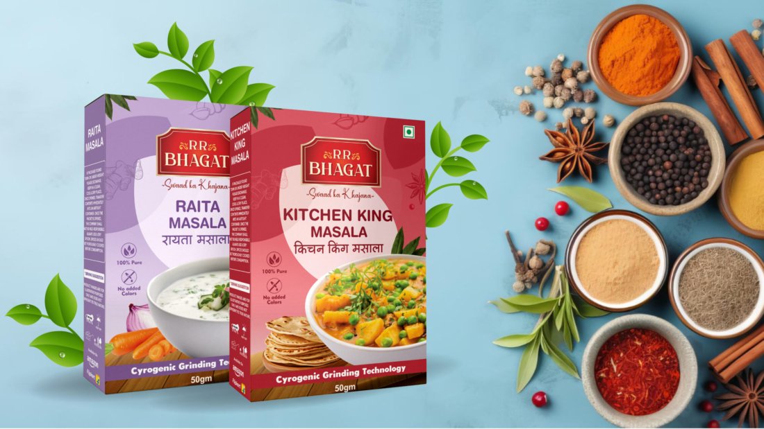
Product Showcase: Designing for Flavor, Trust & Tradition
Every spice in the RR Bhagat product lineup has a unique story, beautifully translated through packaging:
Yellow Chilli Powder – Vibrancy & Warmth
- Packaging uses golden tones to highlight authenticity.
- Striking typography balances traditional roots with modern appeal.
Kasoori Methi – Freshness & Purity
- Designed with green hues, symbolizing health and natural goodness.
- Simple, clean visuals emphasize freshness, connecting instantly with health-conscious buyers.
Kashmiri Mirch – Bold & Flavorful
- Deep red tones represent heat, richness, and festive food culture.
- Visuals evoke the flavors of traditional curries that warm every kitchen.
Pav Bhaji Masala – Nostalgia on a Plate
- Bright orange highlights with street-food inspired typography.
- Captures Mumbai’s cultural food vibe, promising the taste of authentic pav bhaji.
Kitchen King Masala – Royal & Premium
- Royal color palette for a premium look.
- Reinforces the idea that RR Bhagat spices transform meals into celebrations.

Consumer Psychology in Packaging Design
Creador Designs used color psychology, fonts, and imagery to shape consumer perception:
- Colors → Red for appetite, green for freshness, gold for premium quality.
- Typography → Bold, readable fonts for trust and clarity.
- Imagery → Each spice pack visually reflects the dish it elevates.
This ensures RR Bhagat Spices packaging is not just attractive, but also trust-building and memorable.
Creador Designs leveraged color, typography, and imagery to influence perception—aligned with statistics showing that 81% of consumers have tried a new product simply because the packaging caught their eye, and 63% repurchased a product because they loved its packaging.
Why Choose a Branding Agency in Pune for Packaging Design?
Many brands wonder why not design packaging in-house? The truth is, professional branding agencies offer more than design; they provide strategy + creativity.
With Creador Designs, RR Bhagat Spices benefited from:
 Cultural and regional understanding.
Consistent identity across print, retail, and digital.
Future-proof packaging systems for brand scalability.
Designs that resonate with both millennials and older generations.

The Importance of Box Packaging Design in FMCG
While pouches dominate spices, box packaging design plays a vital role in premium positioning and shelf visibility. Creador Designs ensured RR Bhagat’s larger packs carried the same trust and visual consistency as smaller sachets helping boost recall across retail formats.
Product Packaging Design: Connecting Brand & Consumer
In FMCG, consumers spend less than 7 seconds deciding which packet to pick. That’s where product packaging design becomes a game-changer.
Creador Designs made sure RR Bhagat Spices packaging is:
- Visually striking on shelves.
- Easy to understand with clear typography.
- Emotionally engaging, connecting tradition with modern kitchens.

From Grandma’s Secrets to Modern Kitchens: The Emotional Connection
Packaging for RR Bhagat Spices reflects both nostalgia and modernity. With lines like “Swad Ka Khazana”, it builds trust across generations, keeping the brand rooted yet relevant.
Conclusion: Packaging That Builds Legacy
The RR Bhagat Spices project highlights one truth packaging isn’t decoration, it’s strategy. Done right, it enhances trust, recall, and sales.
For businesses looking for a branding agency in Pune or searching for a “packaging design agency near me”, the RR Bhagat success story proves why Creador Designs is the right partner.
This packaging transformation of RR Bhagat Spices was conceptualized and executed by Creador Designs – Pune’s trusted branding and packaging agency.