Packaging is the first conversation a brand has with its audience. Before a customer touches the product, before they read a single word, before they understand what it does — they feel something. That feeling decides everything. At Creador Designs, we don’t treat packaging as decoration. We treat it as experience. And in this project, best packaging design became the tool that transformed a simple product into a premium brand presence — without starting from zero.
This brand didn’t come to us as an idea. It came as a reality. The product already existed. It already had meaning, function, and users. What it lacked was visual authority. It didn’t look like it deserved attention, even though it deserved trust. Our job was not to rebuild — our job was to reveal its true potential through best packaging design.
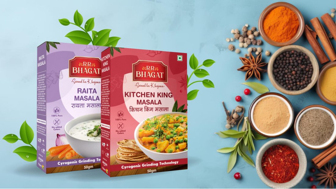
Best Packaging Design Begins With Understanding Before Designing
Before we touched colors, fonts, or layouts, we faced our first challenge: understanding what should not be changed. Many brands think redesign means replacement. We don’t. With best packaging design, the first responsibility is respect.
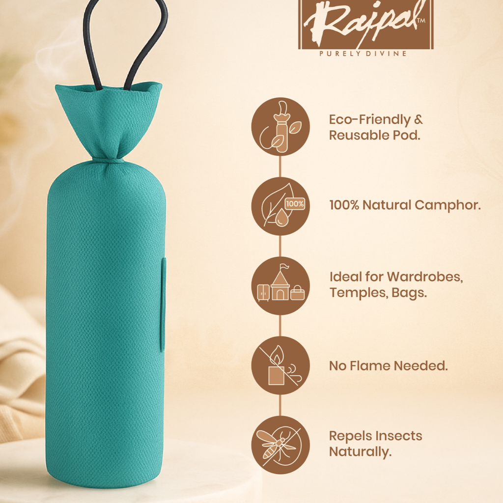
We spent time with the product. We studied how people use it, where they place it in their homes, how it fits into daily rituals. We observed the emotional side of the product — the calm, the purity, the habit, the comfort. The product wasn’t meant to scream. It was meant to soothe. And that insight shaped everything.
The real difficulty we faced at this stage was clarity. The brand had a story, but it wasn’t visually organized. It was scattered. Our challenge was not creativity — it was alignment. We had to translate invisible values into visible design. That is where best packaging design becomes both art and psychology.
Best Packaging Design and the Challenge of Choosing the Right Colors
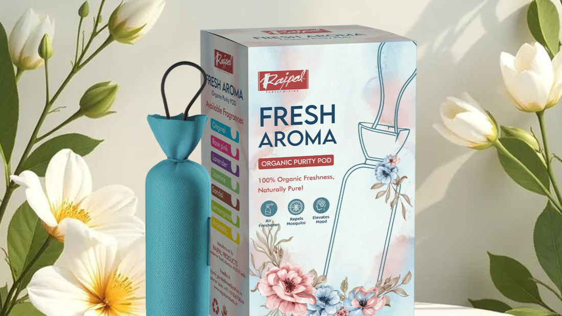
Color is not aesthetic. Color is emotional language. One of the biggest things we faced while creating this packaging was choosing a color palette that felt modern but not artificial, premium but not cold, calm but not boring.
We tested multiple directions. Dark felt too heavy. Bright felt too loud. Neutral felt too empty. The product’s nature demanded balance. So we worked with tones that feel organic and fresh, but still strong enough to hold brand identity.
With best packaging design, colors don’t decorate — they position. We chose colors that reflect trust, cleanliness, and lifestyle. Not just what looks good, but what feels right in a customer’s space. Because packaging doesn’t live on shelves alone. It lives in people’s homes.
Best Packaging Design Is Shaped by the Problems You Solve
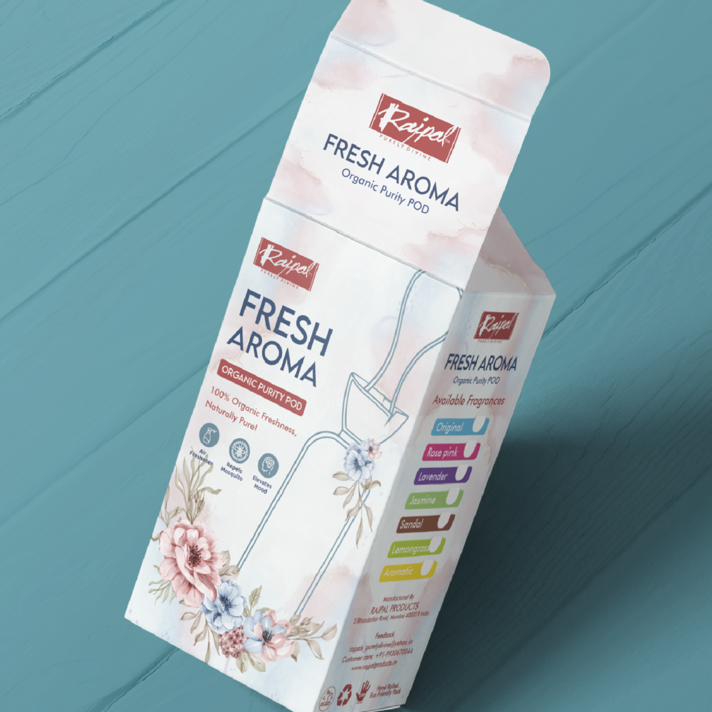
Every design project looks smooth from the outside. Inside, it’s full of decisions, doubts, revisions, and breakthroughs. One of the challenges we faced was visual hierarchy — how to show everything without crowding anything.
The brand had:
• A logo
• A product name
• Usage information
• Emotional messaging
But best packaging design means the eye should never feel confused. So we had to carefully balance what appears first, what appears second, and what quietly supports the rest. We refined spacing again and again. We removed more than we added. Because powerful design often comes from restraint.
We didn’t aim to make the packaging “busy.” We aimed to make it confident. And confidence is silent.
Best Packaging Design and Typography Decisions
Typography is the voice of the brand. And choosing the wrong voice can break the entire message. We faced a key question: should this brand speak in a modern tone, a traditional tone, or a lifestyle tone?
The answer was: all three — but in harmony.
We selected typography that feels clean and readable but also soft and human. With best packaging design, fonts don’t just show words. They show personality. Sharp fonts feel aggressive. Rounded fonts feel friendly. We balanced structure with warmth so the brand feels premium without feeling distant.
Every letter was chosen to support the product’s emotional purpose.
Best Packaging Design Requires Designing for Real Life, Not Just Mockups
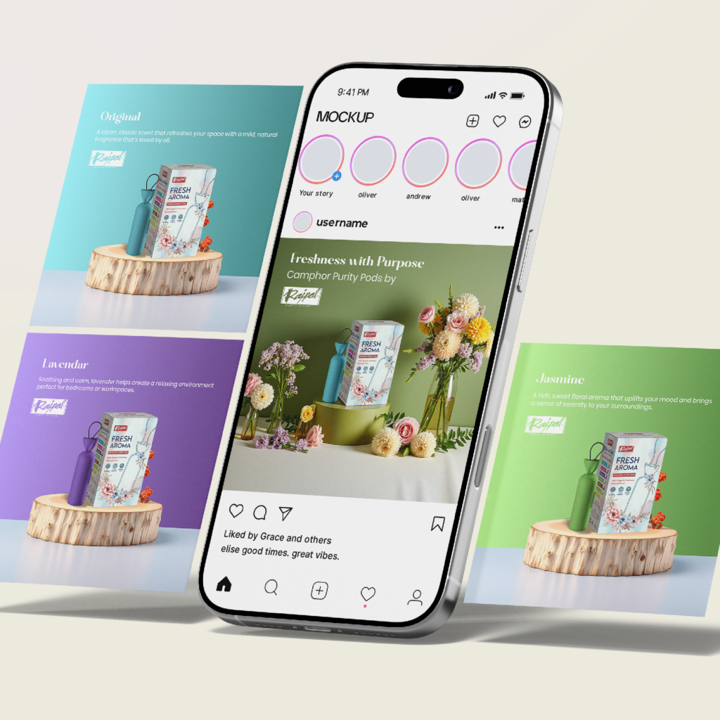
Another challenge we faced was designing something that works everywhere. On a shelf. On Instagram. On a website. In a hand. On a table. Packaging today must perform across worlds.
So we tested the design in:
• Physical mockups
• Social media visuals
• Digital ads
• Website banners
Because best packaging design is not complete if it only looks good in one place. It must adapt without losing identity. That’s why we designed a visual system, not just a box.
Best Packaging Design and the Role of Texture, Space, and Composition
What you don’t put on packaging is just as important as what you do. We intentionally left space. We let the design breathe. We allowed the product to be the hero.
With best packaging design, empty space is not emptiness — it’s elegance.
We structured the composition so the product feels centered, respected, and framed. Nothing feels accidental. Every margin, every alignment, every proportion was tested and refined.
Best Packaging Design Is Emotional Engineering
At the end of the day, people don’t buy packaging. They buy feelings. This packaging doesn’t say “buy me.” It says “you belong with me.”
That’s what we aimed for with best packaging design — not attention, but attachment.
When someone sees this packaging now, they don’t think:
“What is this?”
They think:
“This feels right.”
Best Packaging Design Is Not About Trends — It’s About Truth
Trends change every year. But truth doesn’t. We didn’t design this brand to look 2026. We designed it to feel timeless. That’s the difference.
With best packaging design, you don’t chase style. You build identity.
Best Packaging Design at Creador Designs Is About Elevation, Not Reinvention
This brand didn’t need a new soul. It needed a new mirror.
Creador Designs didn’t create this brand from scratch. We revealed what it was always meant to be. That’s the power of best packaging design — it doesn’t change who you are. It shows who you truly are.
Best Packaging Design Is Your Brand’s First Emotion
And emotion decides loyalty.
If your product is good but your packaging is weak, you lose before you begin. If your packaging is strong, your marketing works harder for you.
That’s why best packaging design is not an option anymore. It’s a necessity


 Cultural and regional understanding.
