Project Earth
Project Earth is a renowned brand specializing in fertilizers designed for plants and trees. Their line of organic fertilizers is particularly noteworthy for enhancing soil structure and promoting microbial activity over time, making them both environmentally friendly and gentle on plant life. These fertilizers can be applied using various methods, such as top-dressing, where the product is spread over the soil surface, or foliar feeding, which involves spraying nutrients directly onto the leaves for quick absorption. Selecting the right fertilizer from their range requires considering factors like the type of plant, its growth stage, and specific nutrient needs, as well as the existing soil conditions and environmental circumstances. Using fertilizers properly is essential to prevent nutrient imbalances and to ensure optimal plant health and productivity.
Project Earth is a renowned brand specializing in fertilizers designed for plants and trees. Their line of organic fertilizers is particularly noteworthy for enhancing soil structure and promoting microbial activity over time, making them both environmentally friendly and gentle on plant life. These fertilizers can be applied using various methods, such as top-dressing, where the product is spread over the soil surface, or foliar feeding, which involves spraying nutrients directly onto the leaves for quick absorption. Selecting the right fertilizer from their range requires considering factors like the type of plant, its growth stage, and specific nutrient needs, as well as the existing soil conditions and environmental circumstances. Using fertilizers properly is essential to prevent nutrient imbalances and to ensure optimal plant health and productivity.

2 Weeks

December 2022

Branding
Challenge:
Project Earth focuses on providing high-quality fertilizers tailored specifically for plants and trees. When it comes to packaging design, the brand aligns with client preferences by incorporating illustrations that directly represent the product inside. This approach not only creates a cohesive and transparent branding experience but also resonates with consumers looking for clarity and authenticity. The design ethos for their packaging is to strike a balance between minimalism and attractiveness. This means using clean and simple layouts that avoid clutter, ensuring that the product itself is the focal point. To achieve this, the design employs a limited color palette, typically restricting to one or two colors. This restrained use of color helps to keep the design sleek and elegant while drawing attention to the product.

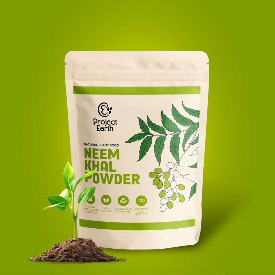
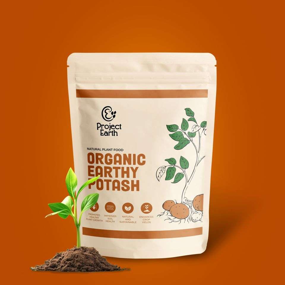
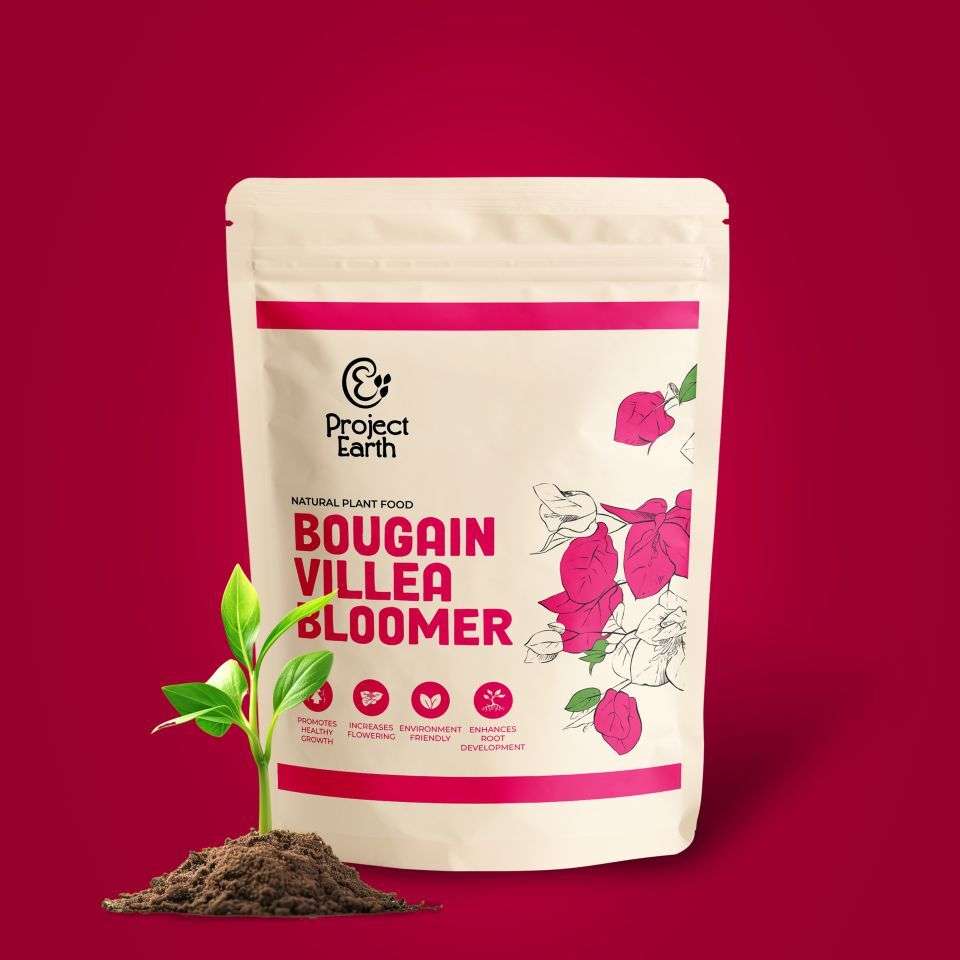
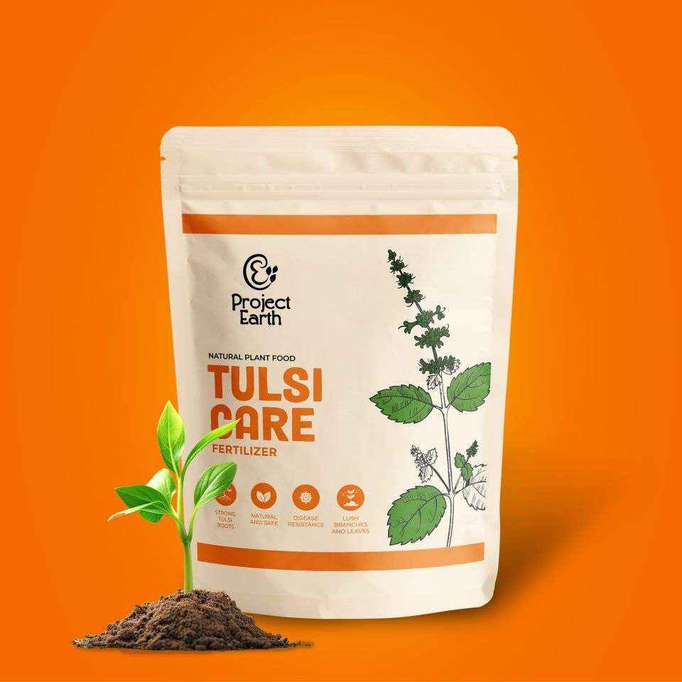
Solution:
To meet our clients' needs, we crafted a packaging design for Project Earth that features line art illustrations of the product itself, aligning with a modern and contemporary aesthetic. Our approach emphasizes simplicity while maintaining an appealing visual presence. The illustrations, central to the design, are rendered in a two-color scheme to provide a clean and cohesive look.We carefully selected complementary color pairs such as red and green, pink and green, or variations of green (light and dark), to create a visually striking yet harmonious effect. These color combinations not only catch the eye but also ensure that the design remains sophisticated and uncluttered.Additionally, all icons on the packaging match the color scheme of the illustrations, which maintains a balanced and unified appearance. This monochromatic approach adheres to the client’s preference for a limited color palette, avoiding the use of excessive colors which can lead to visual disarray.A significant focus was placed on highlighting both the product and its name prominently. This emphasis ensures that the core elements of the packaging—the product itself and its identity—are immediately recognizable and stand out to consumers. The result is a packaging design that is modern, minimalistic, and effectively communicates the essence of Project Earth fertilizers, adhering to the clients’ vision and preferences while ensuring maximum shelf appeal.